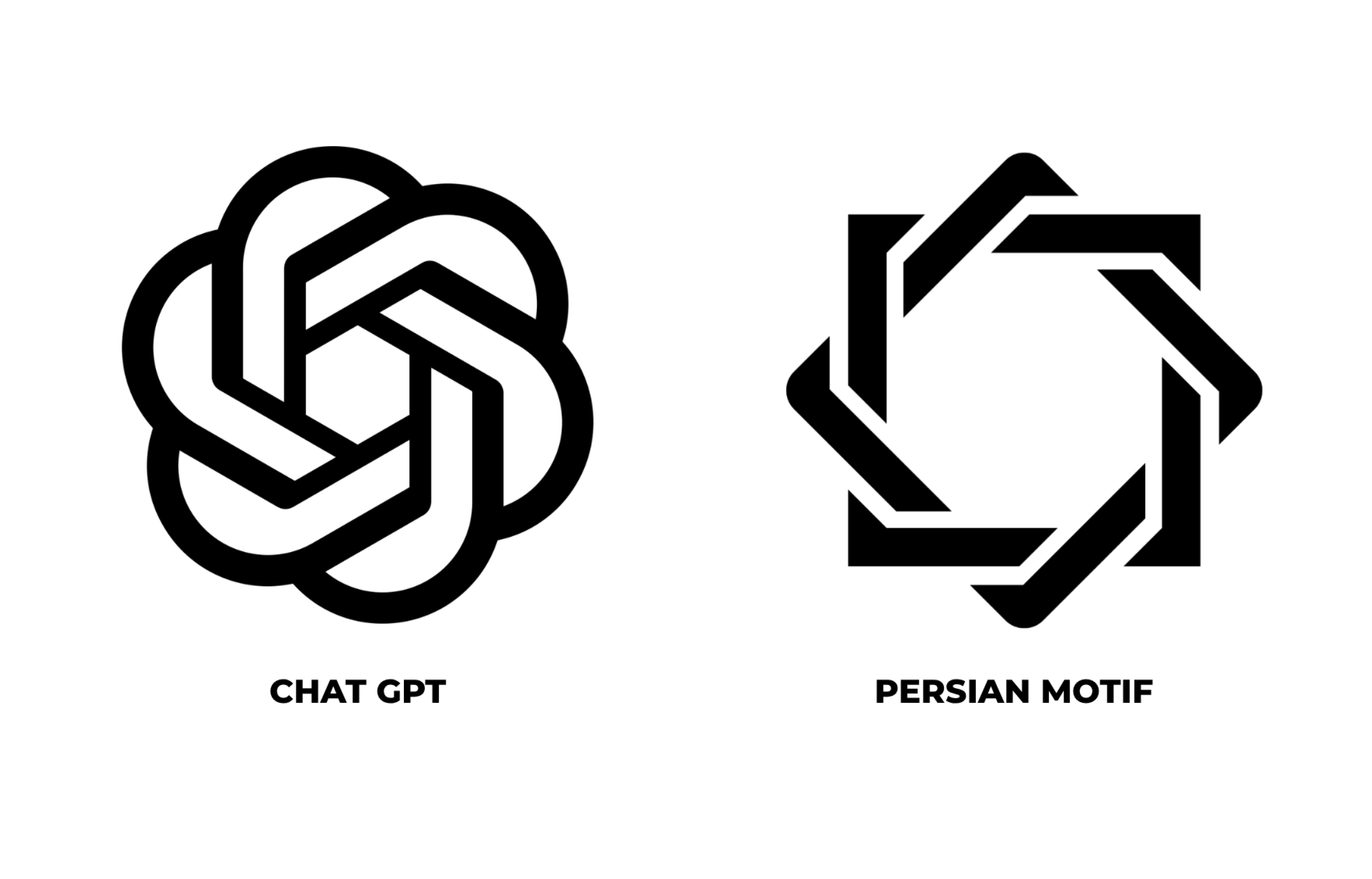
I have spent much of my professional life looking at how organisations use design to become recognisable. A successful visual identity does more than decorate a name. It gives a company, product or idea a form that people can identify and remember.
Artificial intelligence presents designers with a particular challenge. It has no fixed physical form. Its capabilities change rapidly, and the same technology can write, analyse, generate images, answer questions or help operate other systems.
How do you create a clear identity for something so difficult to define visually?
The names and symbols appearing around AI began to catch my attention. Some describe the technology, while others give it a human name or suggest a personality. Some identities appear technical and precise; others feel warm, mysterious or deliberately simple.
Rather than asking only whether these designs are attractive, I want to ask:
what is each identity trying to make visible?
This is the first article in that investigation. I am beginning with OpenAI’s Blossom, the mark now closely associated with ChatGPT, because it created an immediate sense of recognition for me.
A form I already knew
When I first saw the Blossom, I found it unusual for a technology company. Yet the form itself did not feel unfamiliar.
As an Iranian graphic designer, I recognised something in its visual logic: repeated elements rotating around a fixed centre, producing a larger form that appears continuous and complete.
It reminded me of geometric structures I had encountered in Persian visual culture not because the individual shapes were identical, but because they appeared to follow related principles of repetition, rotation, symmetry and central organisation.
The resemblance was not something I had researched in advance. It was simply my first visual response.
Looking at the construction
What caught my attention was not simply that the Blossom could be read as a flower, knot or decorative motif. It was the way the form had been constructed.
The mark is centred and organised through sixfold rotational symmetry. A repeated unit turns around a central negative space, with each part carrying equal visual weight. The outer form remains balanced, while the interlocking bands create movement.
The centre acts as a visual anchor. Everything returns to it, but nothing appears to stop there. The repeated elements move around it and continue into one another, creating a form with no obvious beginning or end.
This produces an interesting tension: the mark feels stable and in motion at the same time.
Its stability comes from symmetry, proportion and a clearly defined centre. Its movement comes from rotation, repetition and the changing relationship between positive and negative space.
These are familiar graphic-design principles. A limited number of elements can create a surprisingly complex whole when they are repeated according to a consistent geometric system.
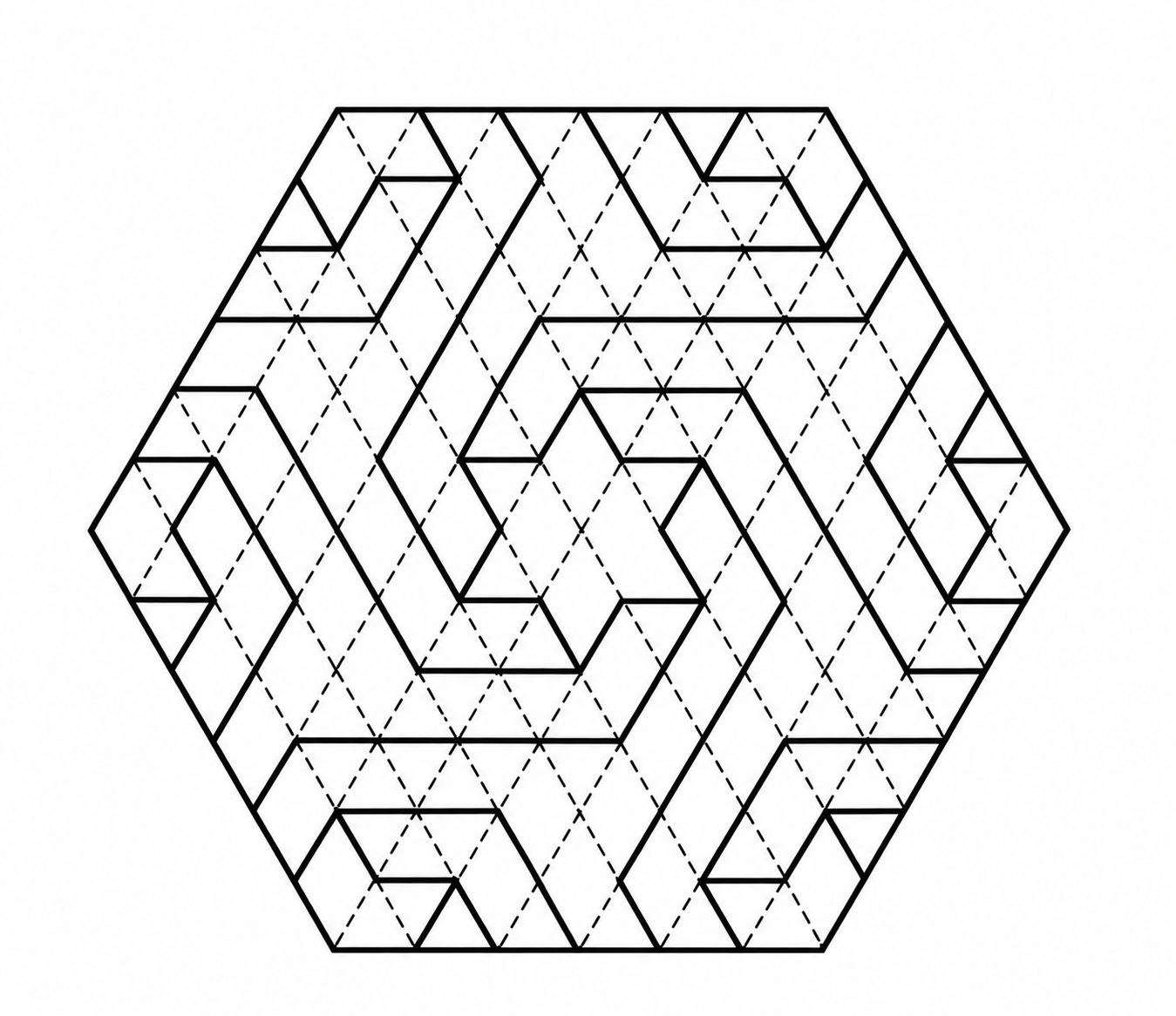
This diagram is useful because it reveals the organising logic behind such patterns. The dashed grid establishes the underlying system; the heavier lines select particular routes through it. Complexity emerges not from many unrelated shapes, but from repetition and carefully controlled variation.
Visual memory and cultural recognition
The construction brought to mind the shamseh (شمسه), a radiant, centrally organised form familiar from Iranian manuscript illumination. I also thought of girih and khatam, where repeated geometric units interlock to create a larger visual field.
I am using these references as a designer, not as a historian or archaeologist. I am not attempting to establish a line of descent between traditional Persian forms and OpenAI’s identity. Nor am I suggesting that OpenAI’s designers copied an existing historical motif.
What interests me is visual recognition: the moment when a contemporary symbol activates forms already present in a viewer’s memory.
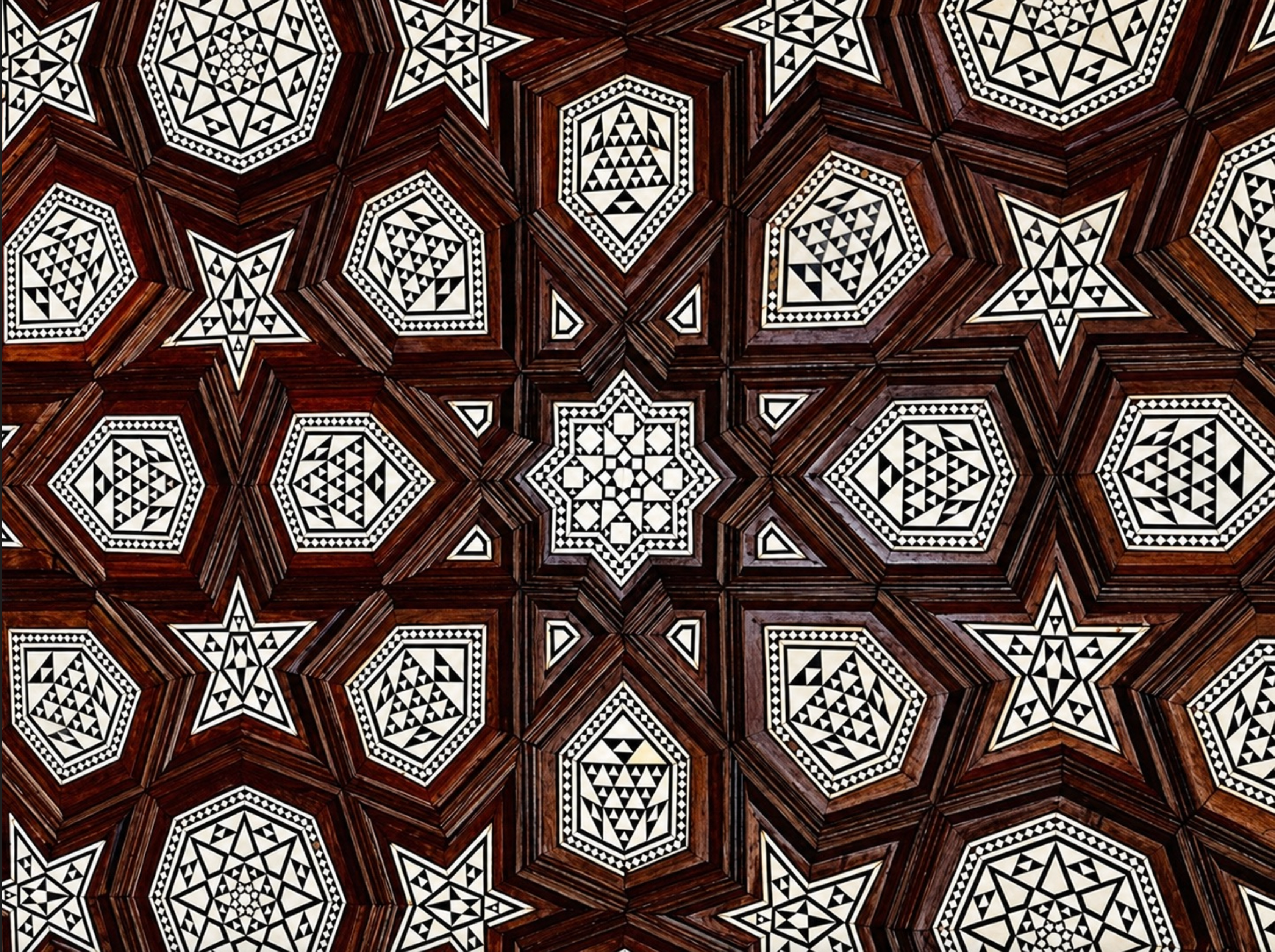
The khatam example is far more complex than a corporate logo, but the two forms share certain organising principles. Repeated units create rhythm. Geometry controls the relationship between the parts. The eye moves between individual shapes and the complete composition.
A logo must compress this kind of visual behaviour into a far simpler form. It needs to remain recognisable at many scales, including the restricted space of an app icon. Detail must be removed, but the underlying rhythm can remain.
Radial floral forms also appear throughout historical art and architecture. Rosettes at Persepolis, for example, organise repeated petals around a strongly defined centre.
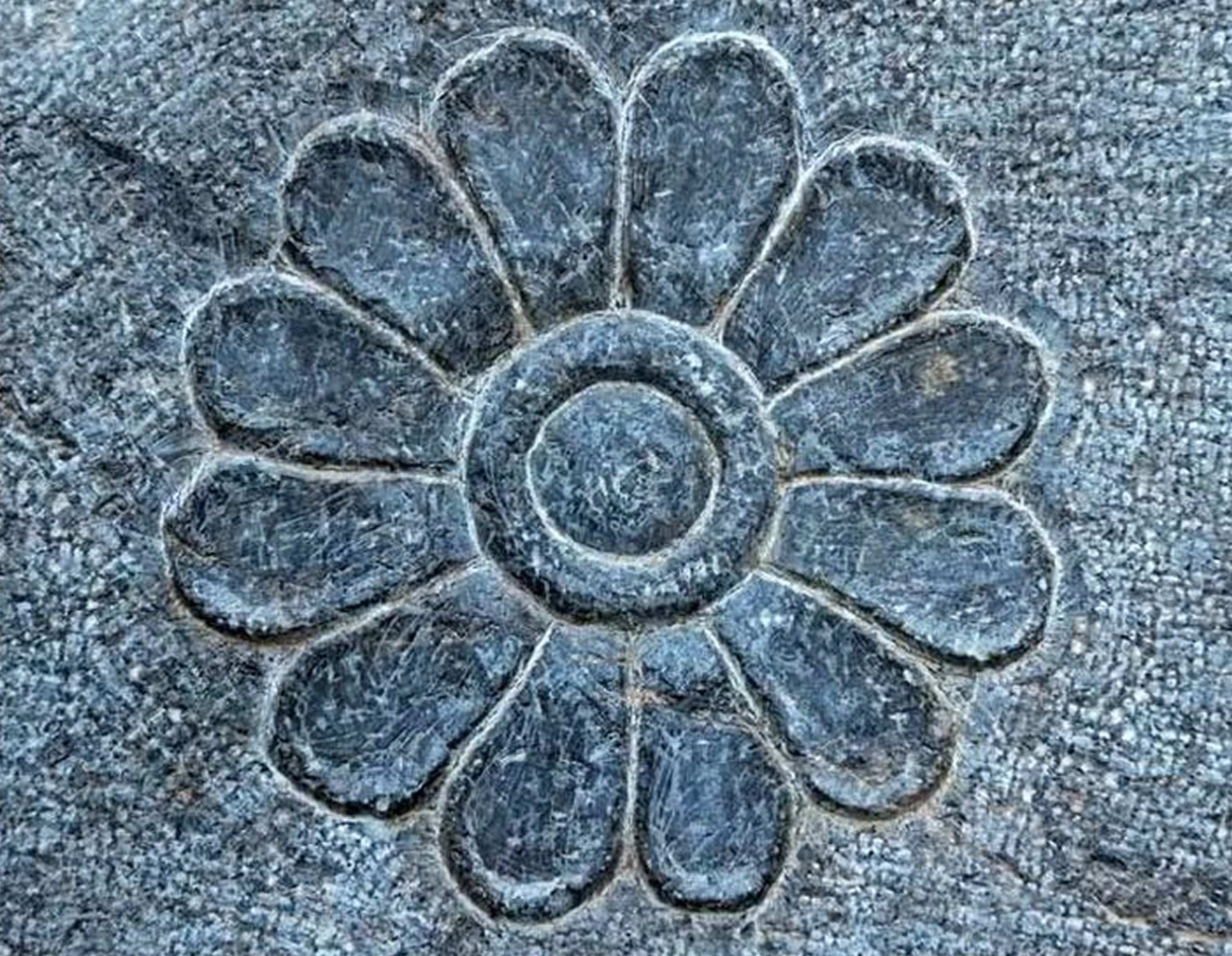
The Blossom is not constructed in the same way as this rosette. One is an interlocking contemporary mark; the other is a radial floral relief. The comparison is about visual organisation rather than identical appearance.
Both direct attention towards a centre. Both use repetition to turn a small unit into a complete form. Both create order through rotation.
Intention and interpretation
OpenAI calls its symbol the Blossom. In its design guidelines, the company explains that the circular elements represent fluidity and human warmth, while the right angles introduce technological precision and structure. Together, they are intended to express the relationship between humanity and technology.
That is the organisation’s explanation of the mark.
My association with Persian geometric forms is a viewer’s interpretation. These two readings do not need to compete, because they answer different questions.
The official explanation tells us what the company intends to communicate. The personal reading tells us what the form may activate in someone who encounters it.
Visual similarity alone cannot establish where a designer found inspiration. At the same time, a designer cannot completely control what other people will recognise in a symbol. Once an identity enters public life, viewers bring their own experiences, cultures and visual memories to it.
This distance between intention and interpretation is not necessarily a failure. It can give an abstract mark a richer life.
From research symbol to product icon
The Blossom was developed for OpenAI in 2016, before ChatGPT existed. ChatGPT was introduced publicly in November 2022, and OpenAI refined its wider identity system in 2025.
That sequence is important. The mark was not originally created to explain a conversational application. It began as the symbol of a research organisation and later became part of the everyday experience of people using an AI assistant.
Although many people now think of it as the “ChatGPT logo,” the Blossom is OpenAI’s mark. Its meaning has expanded through its association with the product.
The name ChatGPT performs a different function. “Chat” describes the form of interaction. “GPT” Generative Pre-trained Transformer, refers to the technology behind it. The name provides information; the symbol provides recognition.
Together, they connect an abstract geometric form to an experience people gradually come to understand.
What can a logo make visible?
If someone encountered the Blossom without the OpenAI name, ChatGPT interface or app, would they immediately recognise it as an AI identity?
Probably not. They might see a flower, a knot, an aperture, a woven structure or something else entirely.
An abstract mark does not have to explain a product at first glance. Its meaning can develop through repetition and use. But a logo cannot explain what artificial intelligence does, how it works or whether it deserves our trust.
Its task is narrower: to create a stable and memorable point of recognition around something that may otherwise feel invisible and constantly changing.
This is the tension that interests me in AI branding. The technology appears expansive and fluid, while its identity must remain controlled and consistent. The product may perform countless tasks, but its symbol must still function within a tiny square on a screen.
OpenAI’s Blossom responds to that problem through geometry. Its centre provides stability; its repeated forms create movement; and its interlocking construction suggests a system made from connected parts.
Yet it also remains open enough for viewers to interpret through their own visual histories.
The next identities
The Blossom is one response to the challenge of making artificial intelligence visible. Claude, Gemini, Copilot and Grok offer different responses through their names, symbols, personalities and relationships with the organisations behind them.
In the next articles, I will examine these identities individually from a graphic designer’s perspective: how they are constructed, what they appear to promise and whether their visual language reflects the experience of using the product.
I began with OpenAI because, before I read the official explanation, I recognised something of my own visual world in its mark.
That experience reminded me that a logo does not carry only the meaning assigned to it by its designers. Its wider life begins when other people start to see it through their own memories.
Sources
OpenAI: Introducing ChatGPT, 2022
Wallpaper*: OpenAI’s 2025 identity redesign
The Metropolitan Museum of Art: Nizami’s Haft Paikar
British Museum: Persepolis relief with twelve-petalled rosettes