The Shape of AI - 02 · Claude
When I first saw Claude’s symbol, I stopped. I knew it belonged to Anthropic, a major AI company, but I could not tell what I was looking at. The shape felt unfamiliar, and its clay orange colour was far warmer than I expected from an AI product.
I assumed these decisions had been considered carefully. That made me want to look again. What had the designers made visible, and why was I finding it so difficult to name?

LOOKING FOR A SOURCE
My first association was with images I had seen in documentaries about particles and the microscopic world. I could sense a centre and something happening around it, but I could not point to a particular phenomenon. The forms did not look like straight rays travelling away from a source. I was reaching for an image that might help me understand the mark, and none quite fitted.
My first impression was that it looked like a sparkle, as though energy were emerging from a source at its centre. When I searched further, I found others describing it as a sparkle, a sun, or something similar.

Then I began to count.
In the version I examined, I counted twelve outward forms. That number brought the twelve months of the year and twelve-part floral patterns to mind. I wondered whether it had been chosen for a reason. I still do. But the count alone cannot tell me what that reason might be, and I have found no statement from Anthropic assigning the number that meaning.
Counting changed my question. I had started by asking, “What is it?” Now I was asking, “How is it built?”
A MOMENT HELD STILL
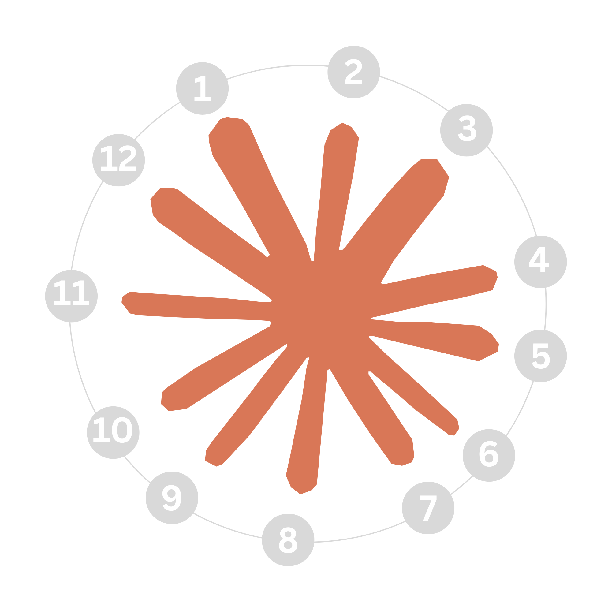
As I spent more time with the symbol, another association came to me: a burst held at the instant it opens. That felt closer to my response than the idea of energy travelling along twelve straight paths. The mark seems to expand from one centre, yet its forms remain joined and contained.
An abstract image of a burst could help show what I mean. I would use it as a record of my visual association, with its own shape and material, rather than drawing the Claude symbol into it. The resemblance I am interested in is the impression of a moment opening outward.

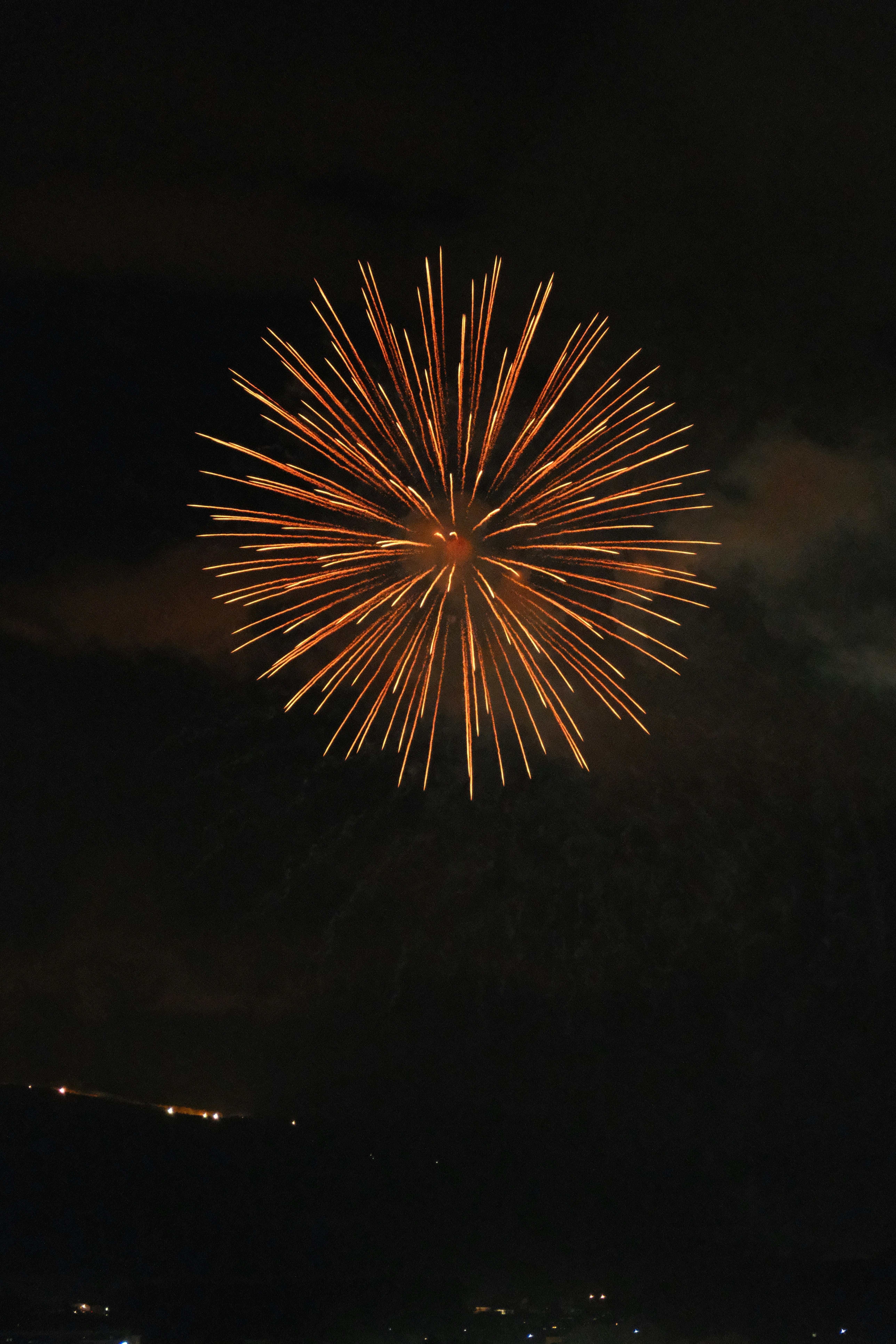
The orange colour brought a different kind of burst to mind: a firework opening against a dark sky. A firework is brief, bright and warm. Its light appears all at once, then changes as we watch it. Claude’s symbol is a fixed graphic, of course, but the comparison helped me describe the feeling I had when I first saw it.
WHAT THE DESIGNERS HAVE SAID
Anthropic’s brand team has described its clay orange in terms of warmth. In an interview, Head of Content Chelsea Larsson recalled seeing the colour in an advertisement and experiencing it as a “warm fire.” The team also discussed the different roles of the two names: Anthropic speaks for the company and its work, while Claude is the product people encounter directly.
Geist, the studio that worked on Anthropic’s wider identity, says it developed a colour system to bring warmth to the brand. Its account also describes a visual language that combines technical craft with human qualities. These accounts help me understand the colour and the broader identity. They do not say that Claude’s symbol depicts a burst, a firework, a particle or a flower. Those remain ways I have tried to read it.
THE SHAPE THAT STAYED WITH ME
My first article in The Shape of AI began with recognition: OpenAI’s symbol reminded me of the shamseh in Persian visual culture. Claude gave me a different experience. I saw its colour and its centre, followed the spaces between its forms, counted them, and still could not settle on a single image.
That uncertainty has become the most interesting part of looking at it. The symbol is clear enough to recognise again, but open enough to send my eye searching. The burst and the firework are part of that search. They helped me describe a fleeting impression; the close-up and the count helped me examine the graphic itself.
After looking closely, I understand more about how the symbol is built, but I still don’t know what it represents. Perhaps there is a specific idea behind it. Perhaps it was never meant to depict anything in particular. For now, that question remains open and I find myself looking again.
SOURCES
Anthropic brand team interview, The Subtext: https://www.thesubtext.online/all/anthropic-interview
Geist’s account of its work with Anthropic: https://geist.co/work/anthropic